Brand System — Field & Found
Typography, packaging, and brand applications.
Positioning
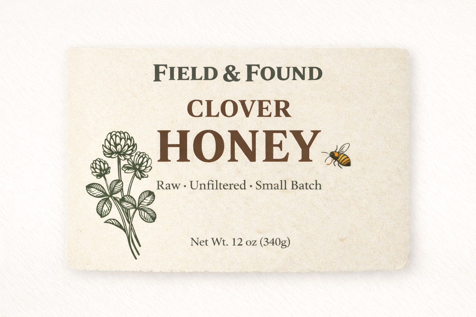
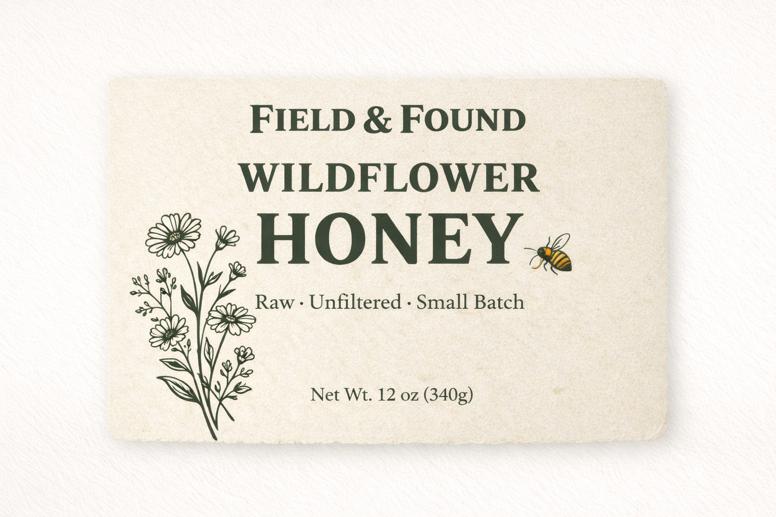
Field & Found is positioned as “honest craft.” The identity needed to feel rooted and tactile, while remaining clean enough to scale into modern packaging and digital touchpoints.
System Logic
The system relies on typographic hierarchy, restrained ornament, and repeatable packaging structure. Every application follows the same rhythm: headline weight, spacing rules, and label composition.
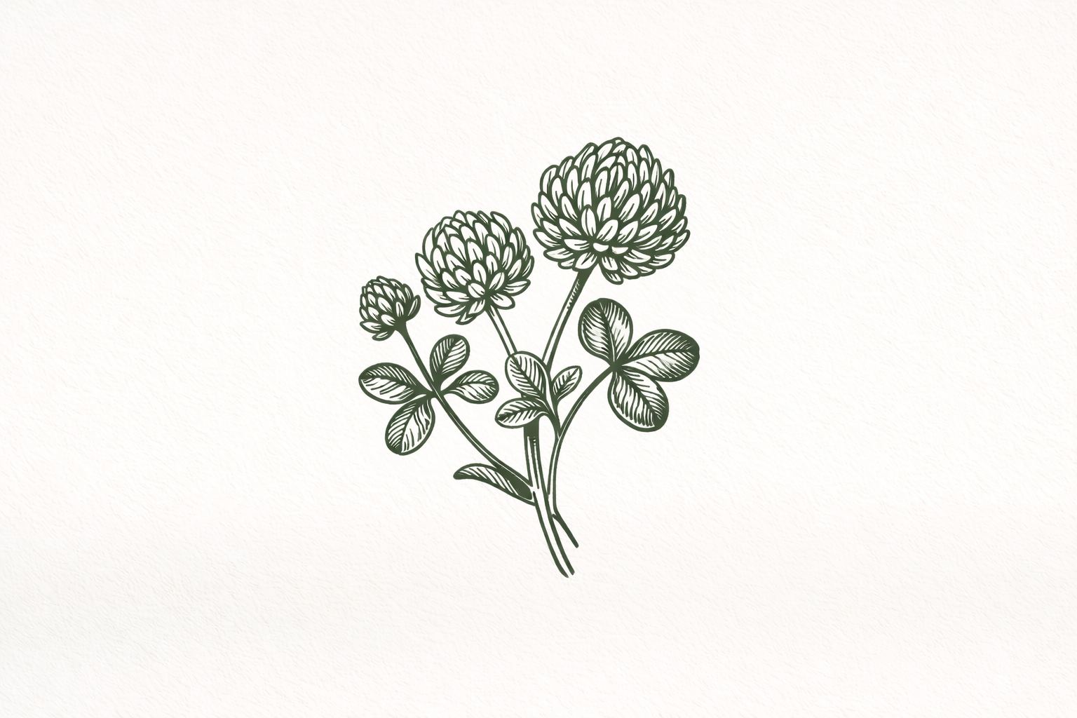
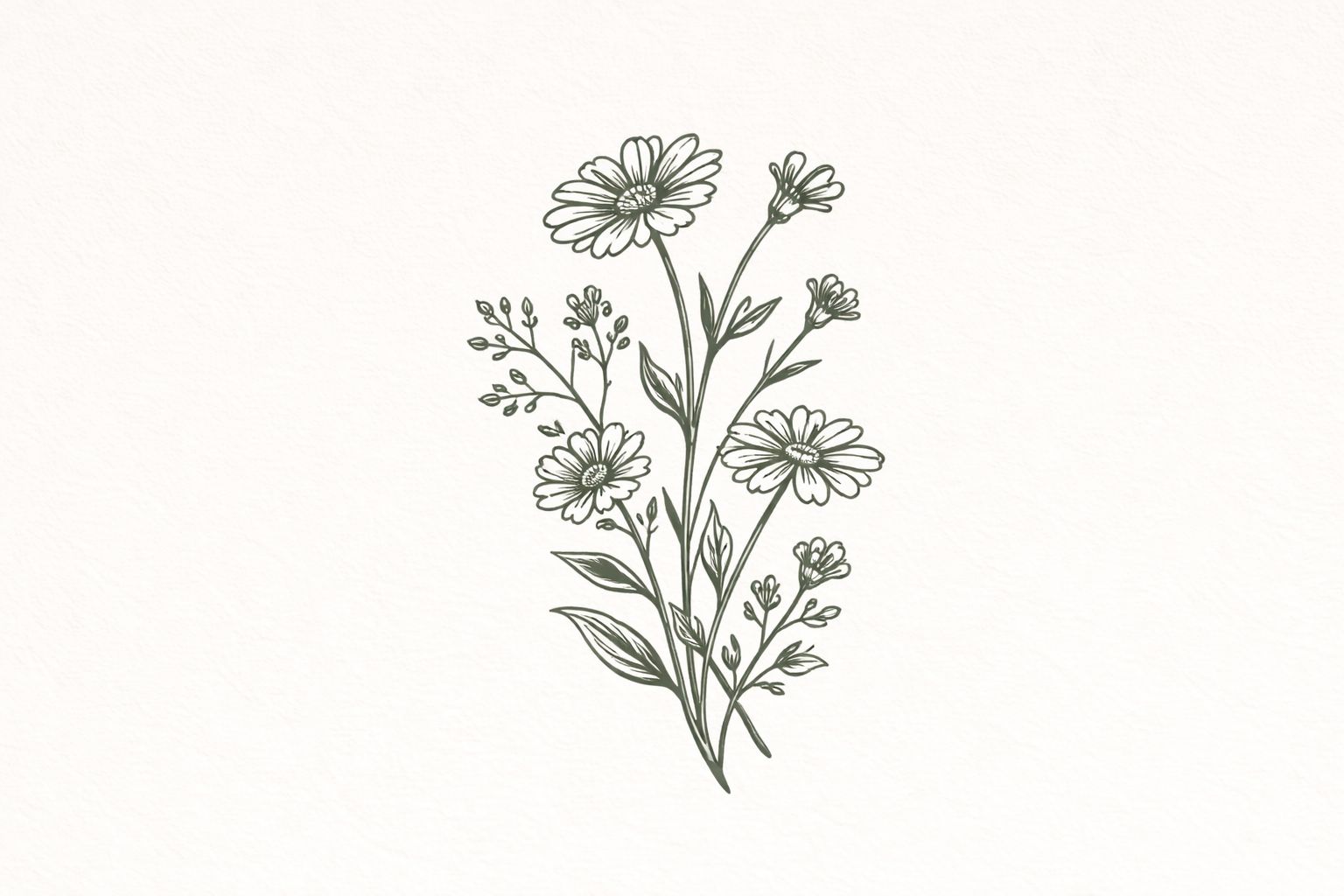
Gallery
Tap / click any image to open full-screen. Use ← → to navigate.
System Overview
Field & Found
01
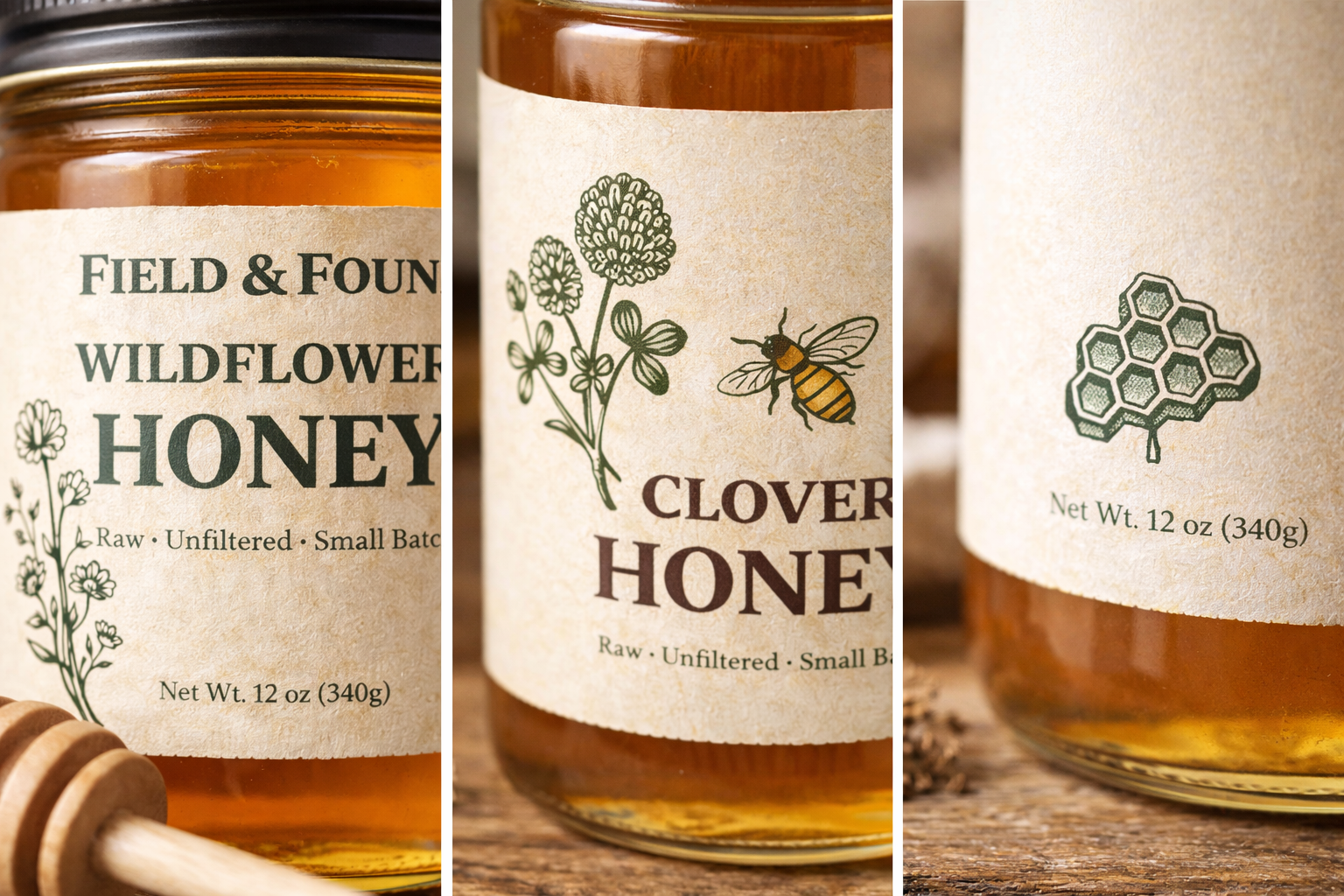
Packaging System
Application
02
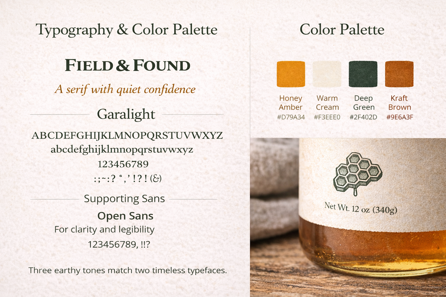
Typography
Hierarchy
03

Label Layout
Structure
04
Packaging Details
Finish
05
Patterns
Texture
06
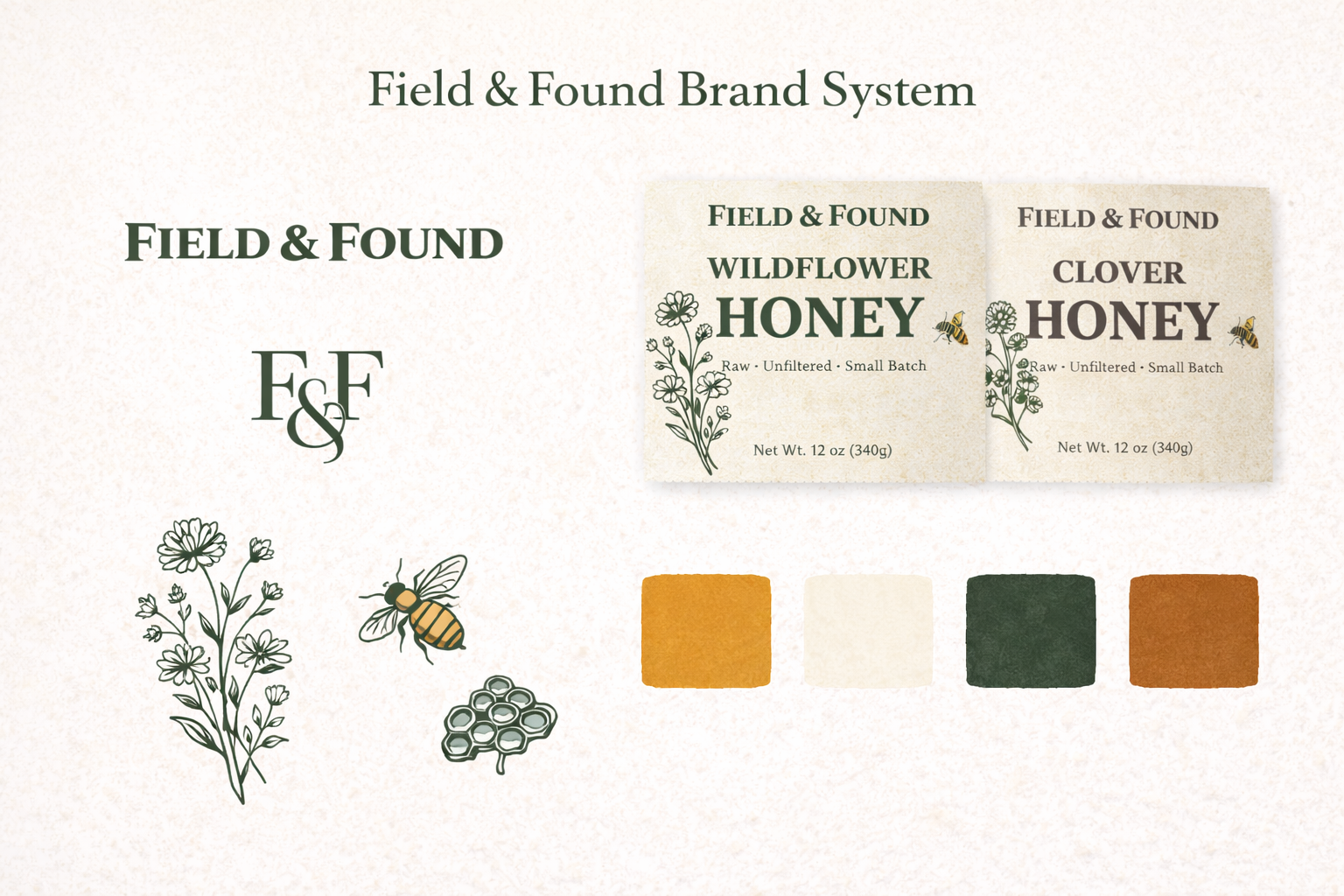
Brand Marks
Identity
07
Applications
Mockups
08

System Pages
Guidelines
09

Packaging Spread
Range
10
Final
Detail
11