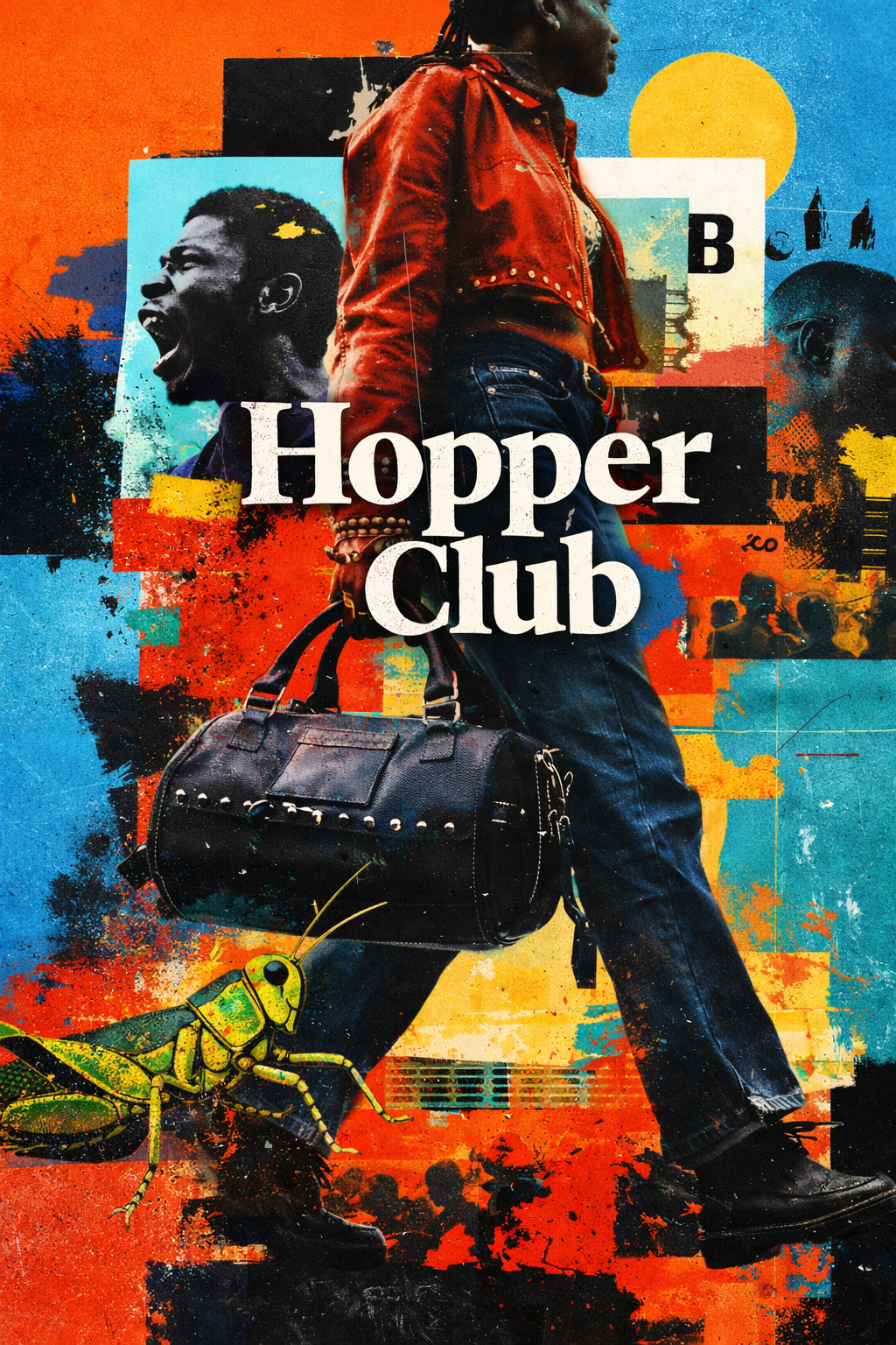
Brand System — Hopper Club
Identity system, packaging, and brand visuals designed for a bold craft beer presence.
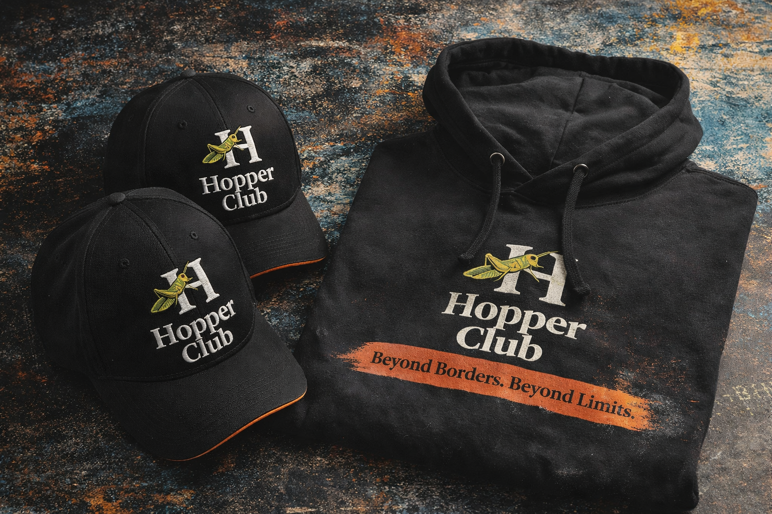
Positioning
Hopper Club is positioned to feel energetic, collectible, and visually loud without losing structure. The identity needed to stand out in packaging while still feeling intentional, premium, and system-driven.
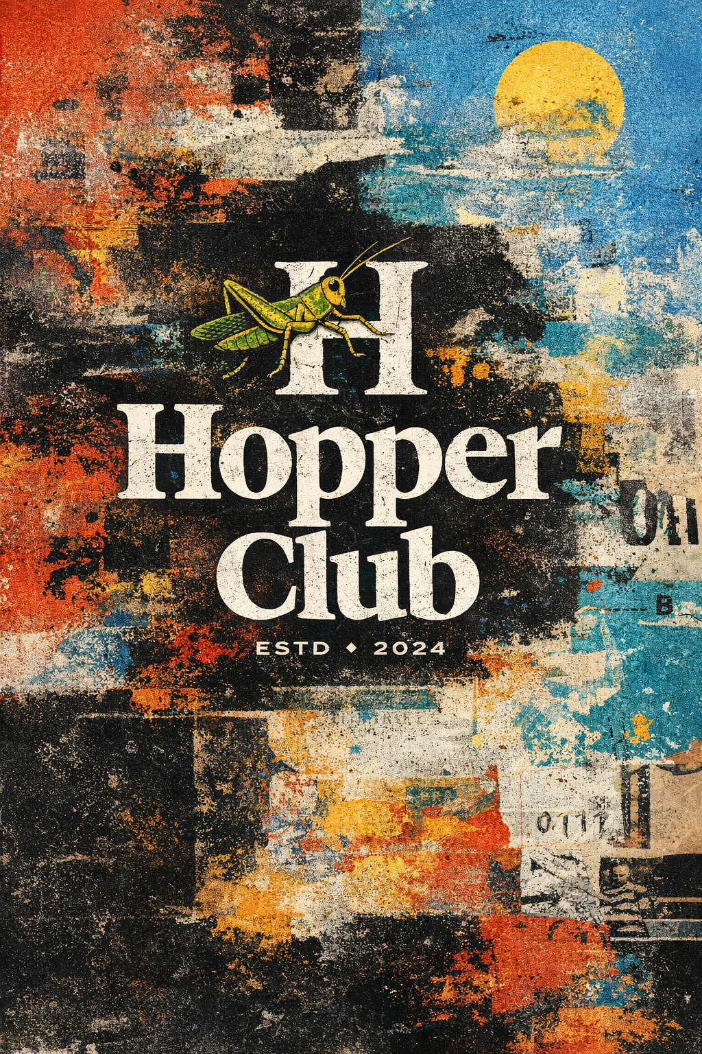
System Logic
The system relies on contrast, layered layouts, strong color relationships, and packaging consistency. Every application follows the same rhythm: high visual energy anchored by repeatable structure and brand cues.
Gallery
Tap / click any image to open full-screen. Use ← → to navigate.
System Overview
Hopper Club
01
Packaging System
Application
02
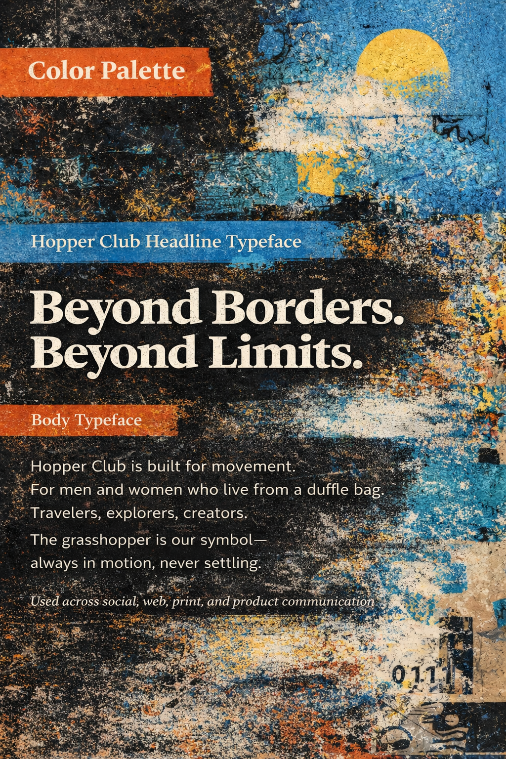
Typography
Hierarchy
03
Campaign Visuals
Direction
04
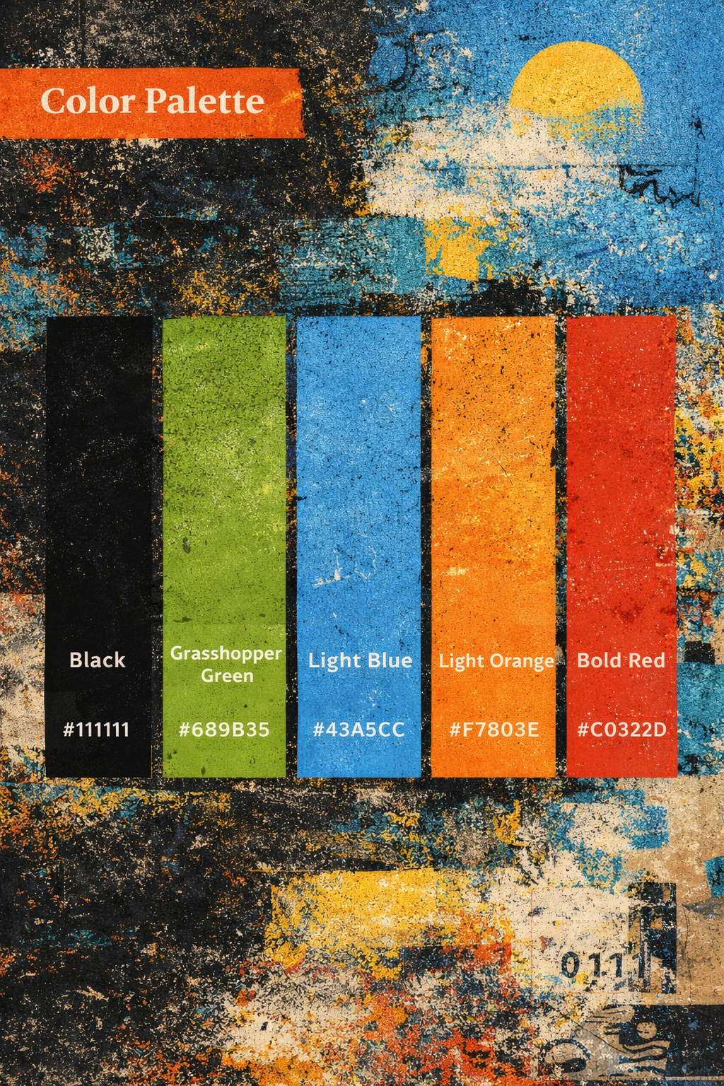
Color System
Palette
05
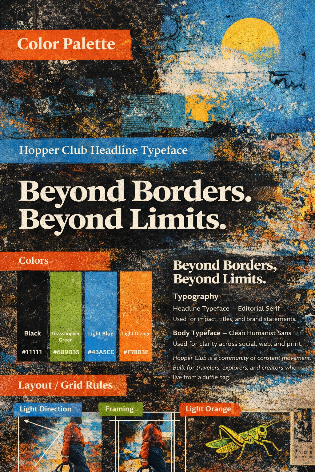
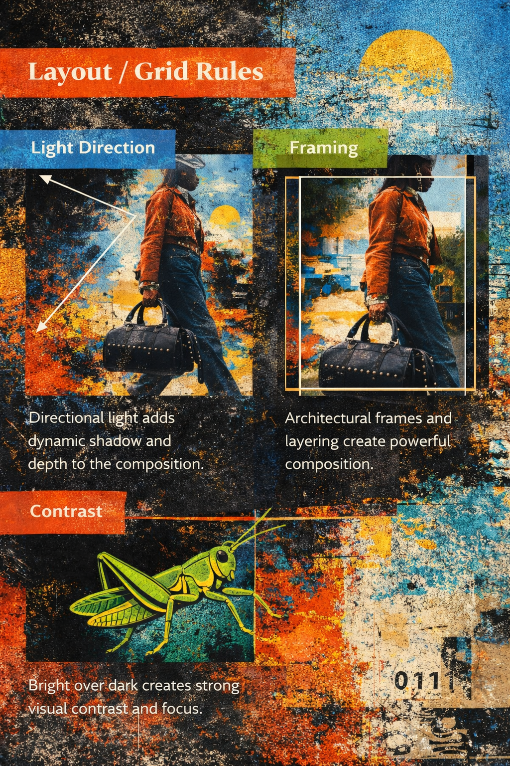
Layout Study
Structure
06

Brand World
Identity
07
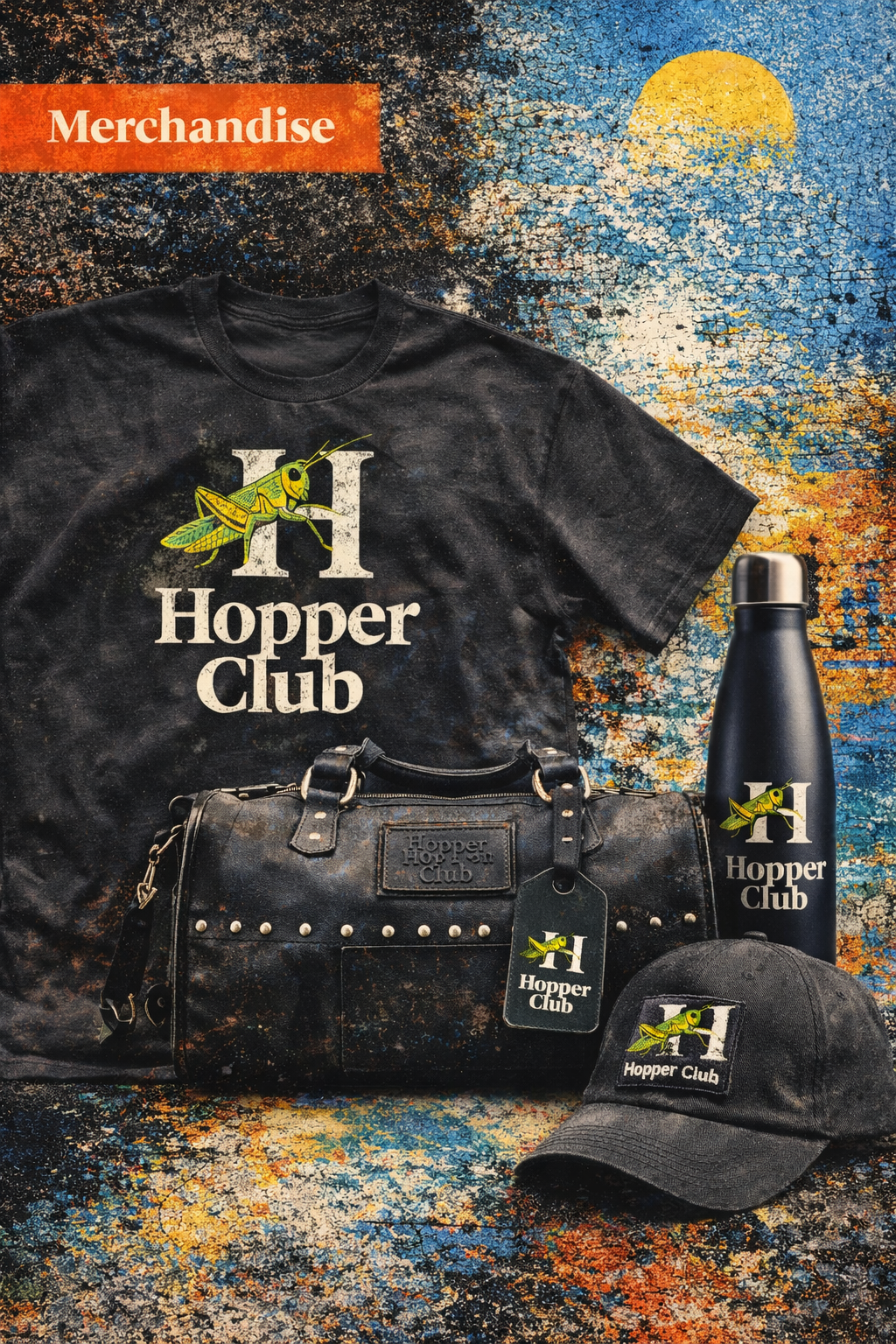
Applications
Mockups
08
Product Marking
Detail
09
Packaging Mockup
Range
10

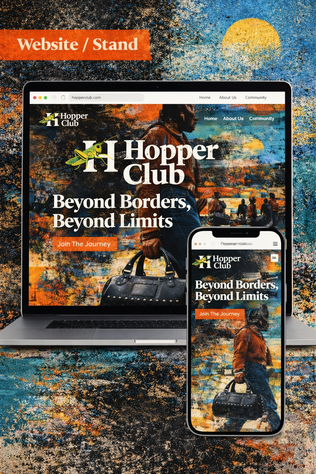
Lifestyle Application
Final
11